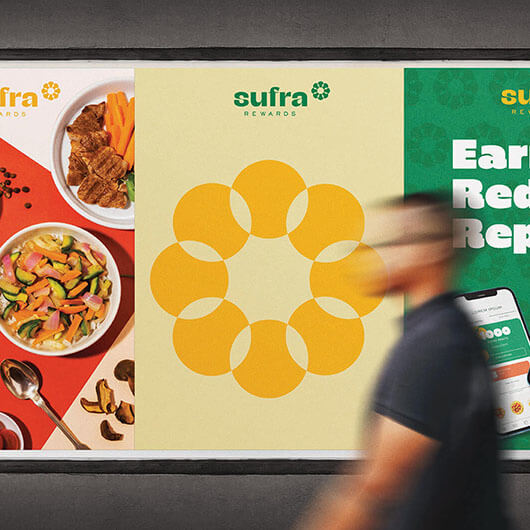
Sufra Rewards

Launching a fun loyalty programme in Saudi Arabia

What should we order? The eternal question….

Loyalty programmes. They’re everywhere and we love them!
You get rewarded for drinking your favorite coffee, for flying with your favourite airline, for doing that Barry’s class, for feasting at your favorite restaurant! And that sense of belonging has become as important as the value you’re getting – especially for the current generation.

And Alfa.Co is no stranger to that. They are fast-growing operators of casual, fast casual and healthy dining restaurants in the Kingdom of Saudi Arabia. The client’s objective was to rebrand their loyalty programme to become the leading F&B integrated multi-brand loyalty programme (with a mobile-first approach!)

We had a real opportunity to create a unique positioning encompassing several functional and emotional benefits. To create a brand that is truly loved, one that you would brag about.

Steak on you, Pizza on us!

It was all about exploration. About discovery. After all, the loyalty programme includes so many restaurants to choose from!

With the explorer brand archetype and a defined positioning of the customer is at the heart of everything we do, we then proceeded to name the programme.

What resonated for us? Sufra.
As referred to in the region, a generous table full of food.

The challenge? Make Sufra rewards connect with the youth of KSA.

Our goal was to bring this programme to life through a lighthearted, vibrant identity; to appeal to the foodies, the families but also the young & active gen Z.

How? With ‘YOU at the heart of everything we do” as the soul of the brand, we developed a unique logo and icon that draws directly from the name; along with a bright and vivid color palette.

The result? A Bold, inclusive, stylish cool brand that speaks the language of its audience, and has already recruited several loyalists since it launched!

Discover a world of taste.

We worked across different touchpoints and brought Sufra Rewards to life. We also created unique tier names for the loyalty programme.

Now let the fun begin and the tastebuds dance!

Hungry for something extraordinary?

Aside from the fact that our team is full of foodies, we also pack years of extensive experience in F&B branding.

So whether you want to launch the next Cronut trend, or are looking for a refresh of that burger joint, contact us and let the journey begin.

Drop us a line: hello@welcometoyellow.com or message us on WhatsApp.

Mercato Mall

Crafting Community-Centric Campaigns for Mercato Mall

Crafting Community-Centric Campaigns for Mercato Mall

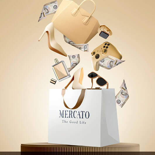
Mercato Shopping Mall, located in the heart of Dubai, stands out with its distinctive Italian Renaissance architectural style and its niche as a community-centered shopping destination. To enhance its positioning and engagement within the Dubai community, Mercato Mall has partnered with us at Yellow.

The objectives of the campaigns have been to strengthen the community ties, boost customer loyalty, engage diverse audiences and enhance the brand perception.

Yellow leveraged its deep expertise in branding and customer engagement to launch multiple strategic campaigns for Mercato Mall, each tailored to resonate with specific audience segments and times of the year.

From back to school, to seasonal and celebration campaigns to loyalty campaigns, each helped position Mercato Mall as a hub for celebration in the community.

Mercato Mall continues to thrive as a community hub, with Yellow’s innovative campaigns playing a key role in sustaining its market position and enhancing its appeal to Dubai’s diverse population.
Through strategic creativity and focused campaign execution and true collaboration with the client, Yellow has demonstrated its capability to drive significant marketing success, ensuring that Mercato Mall remains at the forefront of Dubai’s retail landscape

Ready to become the next upcoming phenomenon?

Drop us a line: hello@welcometoyellow.com or message us on WhatsApp.

Numu

Brand identity for a premium early childhood centre

Where Each Class Is World-Class

Research, strategy and naming:

Welcome to a completely new learning experience, where we inspire curious hearts and creative minds.

Numu is designed with love to reimagine early childhood education. At the intersection of technology and tradition, it’s a nursery focused on ensuring that each day for your child is the best one ever ever :)!

During our workshops, and through comprehensive research into the audience needs, market gaps and global benchmarks, we realized that parents are really looking for a safe, joyful, stimulating environment that helps them raise well-rounded children. Our strategic direction focused on the idea of raising the future, while making the present magically memorable.

Name creation is always fun and challenging but in this case, we all gravitated quite quickly towards Numu as it comes from the Arabic word for grow, tying in beautifully with the essence of the brand.

Little Wonders Meet Days Full Of Wonder

Brand expression:

As always, a solid strategy really helps drive the visual exploration of how to bring the brand to life. We knew we wanted to create something that is whimsical, playful but sophisticated, clean and minimal. What we didn’t know was how our creative team would take that brief and just completely blow us away with their interpretation of it!

From a logo that alludes to growth to the cutest looking characters that represent the different sides of children to a palette that is both colourful but also appealing to the sensibilities of the modern millennial parents who shy away from anything garish, it’ s an identity that’s incredibly easy to fall in love with. What inspired our aesthetics? The classic pragmatic, the funky biker, the colorful happy souls.

As always, the brand identity phase was followed by the creation of various touchpoints that really immerse you in the actual brand experience and truly showcase the difference. Each application was thoughtfully crafted to appeal to parents who want to ensure their children are in a safe space that fosters a love of learning.

Extraordinary Beginnings Lead To Extraordinary Lives

And extraordinary partnerships lead to extraordinary brands.

So if you have a business that you want in the safest, most passionate and creative hands,
get in touch with us on
hello@welcometoyellow.com

Ready to become the next upcoming phenomenon?

Drop us a line: hello@welcometoyellow.com or message us on WhatsApp.

Clement Lombelle

Branding for the next big drop in fashion

An uncompromising “je ne sais quoi”.

In fashion, it’s all about the next big drop. The latest Adidas x Moncler collab, the Jacquemus Chiquito, the Loewe Cloudtilt- you name it! And don’t we all live for that? So when our client came with their prototype of sunnies, our jaws dropped. This IS the next big drop. We know it.

We needed to create a brand that breaks free from the constraints of daily life, one that pushes self-discovery and freedom; yet is a lasting timeless slice of luxury. Something for the seen and be seen, for the gifters, for the quiet fashion gurus… something that would enable everyone to celebrate their uniqueness, one way or another.

Handcrafted somewhere in France, Champagnole.

Welcome to the world of Clément Lombelle. A world where elegance meets luxury, where craftsmanship exudes uniqueness. Yellow’s mandate: to create a brand that makes a statement; one that embodies the artistry and edginess.

We developed the strategy, claiming a unique positioning for Clément Lombelle. One that is a reflection of our target audience’s state of mind.
What inspired our aesthetics? The classic pragmatic, the funky biker, the colorful happy souls.

The whole journey with Clément Lombelle from strategic foundation to visual identity development was one embracing imagination, individuality, sophistication and artistic expression.

The outcome? The next big drop! And we can’t wait to get our hands on a pair!

Looking to be the next big trend?

You’re walking on the right street!

We’ve brought some of the coolest brands to life. With extensive experience in luxury, fashion and across plenty of other industries; whether you are looking for the scandalously chic or the cool unapologetic, we’ll make it happen!

Our team is a ‘juste milieu’ between eternal classics and TikTok addicts! But what do we all have in common? We make the impossible possible. And there’s absolutely no challenge we throw-in-the-towel on!

Ready to become the next upcoming phenomenon?

Drop us a line: hello@welcometoyellow.com or message us on WhatsApp.

Days Off

Rebranding an effortless apparel brand

Woven with threads of comfort, elegance and a touch of wanderlust.

Step into the world of Days Off, where comfort is not just a feature, it’s a promise. UAE-born and grown brand with show-stopping vibrant colors, comfortable garments and sleek cuts- this is what the brand is about.

Our mandate? Revitalise the brand and make it top of mind for comfortable wear. Take it out of home and into gyms, beaches, for running supermarket errands, coffee dates…adapt it to the culture and resonate with all types of women, for all types of occasions.

Basically, be the brand for every ‘Day Off” of our audience’s life- whether it is gorgeously comfortable or effortlessly relaxed they are seeking.

A cocoon of tranquility for the modern woman who seeks solace in every moment.

Days Off embodies the every woman. A relatable and wholesome woman that feels connected to her community. One that is authentic, friendly, realistic, unpretentious and welcoming.

With a clearly defined personality and brand essence, we developed Days Off’s identity; one that appeals to comfort and elegance seekers, homegrown heroes and supporters, the REAL people.

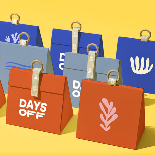
A vibrant color palette, a unique illustration style that embodies that feeling of day off you would relate to. Tote bags, beach towels, pouches and tags- the brand embodies timeless versatility, tranquil comfort, and sustainability.

Want to capture the spirit, values, and unique qualities that set your brand apart?

Welcome aboard! You’re in for quite the experience.

We’ve partnered with some of the most successful homegrown heroes from unapologetic jewelry brands to the juiciest burger joints; and we know exactly how to make you relevant, how to get you loved (and talked about)- did we mention by the whole world and not just the local community?!

Let us make you the next homegrown hero!
Drop us a line:
helllo@welcometoyellow.com or message us on WhatsApp.

Fine Arts

A Place of Discovery

Welcome to Fine Arts

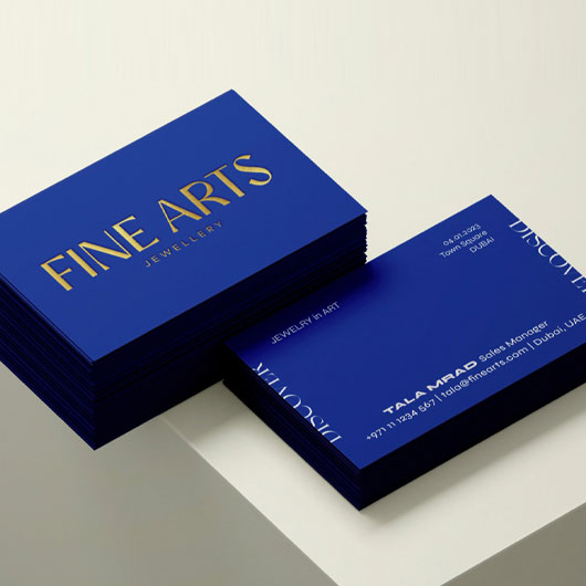
We worked across different touchpoints, from the image style to packaging, all the way to social media look & feel. The intent was to showcase an unusual yet effortless form of grandeur, one that is home to some of the finest brands around the world.

A place of discovery

DTC has disrupted jewelry.

It’s no longer something you wait for your significant other to hopefully buy once a year for your birthday ????! Now, it’s all about self-expression and self-gifting – from me to ME! We love the new generation’s aversion to “diamonds are forever” and should cost 3x your salary in favor of street-wear styles, stacking and independent, colorful brands.

So when our client came to us with the idea of an outlet that stocked the most coveted DTC and eclectic brands from around the world, we were on board and in love!

We wanted to create a brand that flirts with the edges. A brand so boho and whimsical that it screams unexpected, sublime. A brand that is simply…it!

A destination, a mood, a moment!

The it place, the discovery, that avant-garde destination where you will always find something new to fall in [or express] love with.

A brand that celebrates art, self-expression and discovering the IT girl in you.

With the strategy in place, we developed the unapologetic brand identity. One that illustrates the destination. A destination for those who are champions of self-expression, curators and narrators of their own story.

Seeking the unexpected?

You’ve come to the right place!

We’ve partnered with some of the most successful brands across the region – from the finest jewelry to the coolest restaurants and avant-garde tech platforms!

Not sure how to stand out within your landscape? Yellow does!
We will encourage you to flirt with the edges of your tastes, break the barriers and be a little braver in your choices!

You and us? We can make magic happen!

Drop us a line: helllo@welcometoyellow.com or message us on WhatsApp.

Ovasave

Branding for an innovative fem-tech platform

Brand strategy, brand identity, tone of voice, messaging, website, social media, photography style and packaging for the first FemTech platform centered on giving women total control over their fertility journey.

TikTok over Tick Tock

OvaSave is the first fem-tech startup of its kind in the region, with a focus on fertility and women’s health. A tech platform that provides women with access to fertility and egg freezing services across a vetted network that will grow to more than 50 partner clinics in 10 countries and 20 cities.

We created a brand strategy that encourages women to fight against the tyranny of the dreaded biological clock that has ruled their lives and open their minds to options.

Freeze your eggs, not your ambitions.

We spoke to multiple women to understand the concerns, barriers and customer journey and benchmarked against some global brands that are in a similar space. The led to the creation of a brand platform centered around the idea of being there for a new generation of women, helping them pursue their amibitions and put themselves first.

We loved creating the tone of voice and messaging for this brand, which is rebellious, powerful, encouraging, unconventional and energetic.

Productive now. Reproductive later.

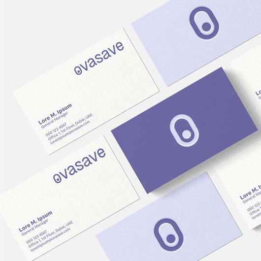
With the brand centered around the idea of putting women in charge of their biological clock, the logo depicts this by subtly incorporating an on / off switch withing the O.

We developed a rich visual language made up graphical devices and illustrations to support an image style that shows women living their life to the fullest, pursuing their personal and professional goals. A full set of original icons were also created for use throughout the website and app, along with packaging for the testing kits, social media look and feel and design of various collateral.

Ready to create now?

We’ve been working on some incredible tech platforms and DTC brands. If you have seen a gap in the market, a pain point that you have a great solution for and have been wondering whether to take the leap or not, we say go for it! If it’s a REALLY great idea aligned with our values, we also consider partnering for equity.

Drop us a line: hello@welcometoyellow.com or use WhatsApp.

Services included: Brand strategy, brand identity, tone of voice, messaging, website, social media, photography style, and packaging.

Maveroc

The art of rebellion

The art of rebellion

Meet Rita & Ibrahim, an incredibly talented couple that left their established careers to pursue their dreams of creating a bold new fine jewelry brand. Rebellion was a major theme throughout everything – from the playful, unexpectedness of the pieces created to it being a purely DTC brand to the personality of the founders. This segued into the essence of the brand being centered on the idea of “The Art of Rebellion” – a narrative that was all about celebrating self-expression, confidence, colour, creativity, boldness and femininity.

Why Maveroc

Naming is always one of the most challenging aspects of creating a brand. It’s incredibly personal, subjective and often all the great ideas you come up with are taken. We explored many themes and ideas, focusing predominantly on evocative and associative names – names that communicated the brand idea without being too descriptive (our favourite kind of names)! And thus Maveroc was born.

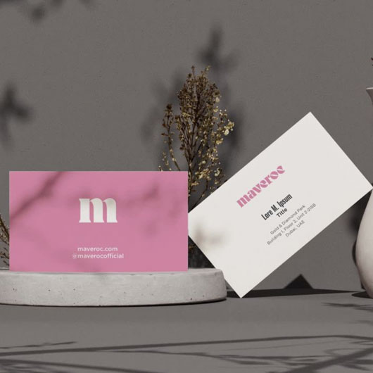
With a strategic foundation in place, a name we all fell in love with and the essence of rebellion at the heart of the brand, we developed the brand identity that consisted of a vibrant colour palette made up of our favourite colours – pink and yellow! The colours of passion, optimism and creativity. We selected contemporary, bold typefaces, and created a visual language that allowed the hero of our story to shine: the jewelry. This was followed by developing all the supporting touchpoints where the brand really comes to life – from creating the packaging and image style to working closely with the founders and various partners to design, direct and launch the website, social media and photoshoots.

Passionate Cheerleaders

The team: Yellow works collaboratively with our in-house team which was made up of Sarah, Mamta, Dan, Stuart along with a special shout out to our partners and collaborators.

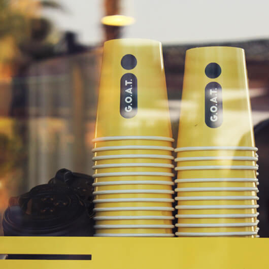
We’ve worked on some of the most successful homegrown brands in the region like OliOli, Cafu, Luma, Goat amongst many others. If you’ve been daydreaming of starting your own business, this is the sign you’ve been waiting for!

Send us an email and let’s go!

Pan Home

Rebranding a beloved home furnishing store

Extraordinary furniture, ordinary prices

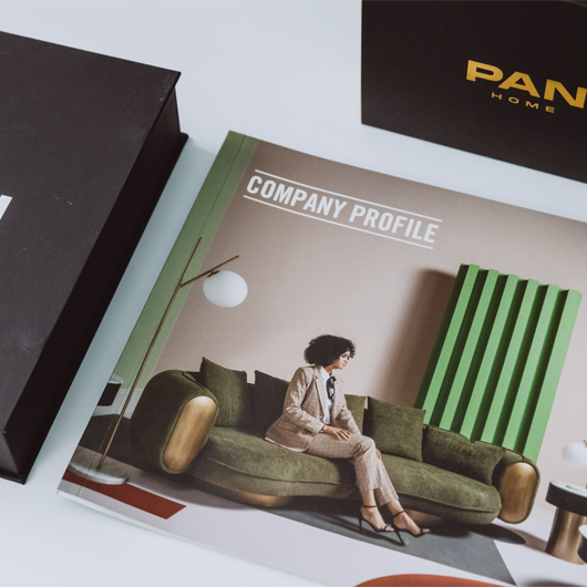
An affordable furnishing brand that started out as a single store 29 years back in Sharjah, Pan Emirates is now one of the fastest growing furniture stores in the region.

The key challenge was to pivot from a mass brand to one that’s in the affordable, accessible luxury arena and appeals to a younger, savvier audience segment, thus expanding their market share.

We conducted multiple in-store, telephone, in-person interviews as well as online (Instagram) and email surveys to understand the brand perception and market. In addition, we looked at reviews on Google, Trust Pilot and Glassdoor and went down Reddit rabbit holes.

Your home. Your style. On your budget.

This led to the development of target audience profiles, identifying primary customers, a messaging style that would resonate with them and of course, the brand platform & story.

HOME COMES FIRST

There’s one place in the world where you feel completely safe. Where you’re free to be yourself and surrounded by lovingly selected elements reflecting your tastes, memories, travels and stories. It’s where you get to invite the world a peek into who you are. It’s your sanctuary. It’s your canvas for self-expression. It’s where there’s finally balance and the noise, the deadlines, the overwhelm just fade away as you walk through the door into the arms of your family or sink into the comfort of your couch.

It’s where you come first. it’s where your family comes first. It’s because at Pan Emirates, we know that Home Comes First.

What’s in a name? A lot, actually.

A name change sends an important signal, which was much needed in this case. We wanted to retain “Pan” because of the brand equity but replace Emirates as the brand had expanded geographically far beyond the UAE. Many iterations were considered but we landed on one that tied best with the essence of Home Comes First and encompassed their offering: Pan Home.

Design your happy.

With a new direction, strategy and name in place, a beautiful, contemporary and much more minimal identity was created. Benchmarked against global DTC furniture brands, the new image style is much cleaner, allowing the products to really shine. The modern colours and typefaces deliver on the repositioning of Pan Home as a brand for a younger audience that is embarking on a new phase in their life (newly weds, a nursery for their newborn, first home).

We also worked with Pan to revamp their website, social media presence as well as advertising campaigns.

Time for your home run

Legacy and heritage brands are facing a bit of a struggle now that the purchasing power has shifted to a new generation with entirely different tastes, behaviours and even language. If you’re figuring out this new landscape and need some help, we are the right partners – our team is made up of Dubaiians who’ve been born & brought up here, to those who have been working in the region for 25 years. Our insights into the local customer behaviour and preferences is second to none, while our ability to design according to the most contemporary global standards is self-evident.

Drop us a line: hello@welcometoyellow.com or use WhatsApp and let’s revamp that brand.